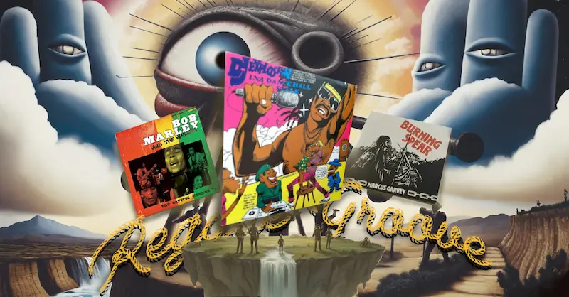
Introduction: Iconic Reggae Album Artwork
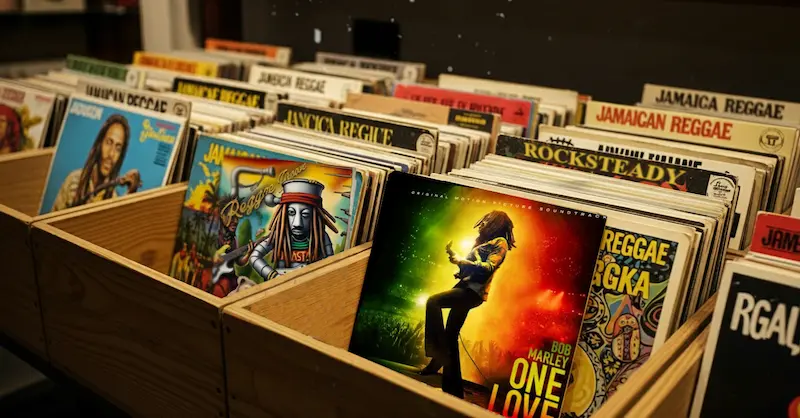
Walk into any record shop with a decent reggae section and you’ll notice something immediately: the covers have a certain pull. Perhaps it’s the striking red, gold, and green; perhaps it’s a blurry picture of a vocalist with dreadlocks looking straight at you; perhaps it’s the bizarre, hand-drawn collage that doesn’t quite make sense until you hear the music. Below, we explore the evolution of reggae album artwork, tracing its early beginnings to its worldwide influence today.
Reggae album art isn’t just decoration; it’s a storytelling device, a cultural banner, and at times, a manifesto of Jamaican identity. I remember the first time I held a worn copy of Catch a Fire in my hands. The original 1973 edition had a sleeve shaped like a Zippo lighter, complete with a flip-top mechanism. It felt mischievous, tactile, and very far from the generic cardboard sleeves most records came in. That’s when it struck me—these covers were doing more than selling records; they were shaping how reggae itself was perceived around the world.
Like the music itself, the visuals oscillate between gritty realism and spiritual transcendence, between DIY improvisation and high-concept design.


Early Reggae Album Art: The 1960s & 70s Jamaican Roots
In the early days of ska and rocksteady, album covers were almost an afterthought. Most Jamaican releases were pressed quickly, often for local consumption, and distributed in plain sleeves or with minimal design. Budget constraints dictated the look. Labels like Studio One or Treasure Isle sometimes used generic printed templates with the album title hastily stamped in.
But even in those modest beginnings, patterns began to emerge. When full covers were printed, they often featured studio portraits—musicians posing stiffly in Sunday-best suits, sometimes with instruments in hand. It wasn’t glamorous, but it had a sense of authenticity.
The faces of The Skatalites, The Maytals, or Alton Ellis staring out from those early sleeves are as much a part of Jamaican record sleeve design as the music grooves inside.
By the late ’60s and early ’70s, as reggae crystallized as its own genre, labels like Trojan in the UK started packaging Jamaican music for export. All of a sudden, the visual aspect became a key selling factor.
British designers reinterpreted Jamaican culture for a European audience, sometimes with awkward stereotypes (tropical beaches, cartoonish dreadlocks), but also with genuine artistic flair. Although those covers might appear outdated today, they were instrumental in bringing reggae to international audiences.
Rastafari Imagery and Symbolism in Reggae Album Art
As reggae matured, the art became more intentional. It wasn’t just about putting a face to the music anymore—it was about projecting values, struggles, and identity.
The Rastafari movement had already begun shaping reggae lyrics, and that influence spilled onto covers. Ethiopian flags, lion imagery, and portraits of Haile Selassie appeared frequently.
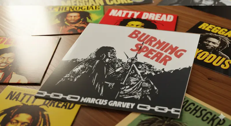
Think of Burning Spear’s Marcus Garvey (1975). The cover, a stark photograph of Garvey with bold lettering, carried as much weight as the music’s political urgency. It wasn’t abstract design—it was a declaration.
Other albums leaned heavily on spiritual iconography. Roots reggae covers often blended photographic realism with mystical symbolism: halos of light around dreadlocked figures, hand-painted depictions of Zion, or montages of African landscapes.
Reggae album art mirrored the yearning in the music—a desire for justice, homecoming, and divine connection.
Of course, there’s room for critique here. Some covers, especially those made for international markets, simplified Rastafari imagery into branding. Red, gold, and green became shorthand for “reggae” in the same way cowboy hats became shorthand for “country.”
That reduction may have helped sell records, but the complex beliefs and history of the Rastafari movement were oversimplified and turned into a simple brand or fashion statement for the international market.


Bob Marley and His Iconic Album Covers
You can’t talk about iconic reggae covers without landing on Bob Marley. Not because his were always the most creative, but because they became the most recognizable worldwide.
Take Catch a Fire. The Zippo lighter sleeve was conceptual, cheeky, and utterly unlike anything else in reggae at the time. It was Island Records’ way of positioning Marley as a global rock star rather than just another Jamaican singer. Later pressings swapped the gimmick for a portrait of Marley smoking, which has since become one of reggae’s most reproduced images.
Rastaman Vibration (1976) pushed things further. The textured sleeve looked like burlap, with Marley’s figure outlined like a revolutionary poster. It wasn’t subtle; it screamed “movement.” By the time Legend rolled around in 1984, the cover—Marley, chin in hand, staring thoughtfully—was practically canonized. That single photo has probably done as much to define reggae visually as Marley’s music did sonically.
There’s an argument to be made, though, that Marley’s global success standardized reggae visuals. After his rise, the “serious dreadlocked prophet” portrait became almost obligatory. While impactful, it limited the portrayal of reggae’s visual narrative, at least in the eyes of the mainstream.

Dub Record Covers: An Illustrated Exploration of Experimental Reggae
Dub record covers took a completely different approach from roots reggae, which frequently pushed toward realism and political gravity. The music itself was an experiment—echoes, reverb, stripped-down instrumentals—so the covers followed suit.
Look at Scientist’s series of albums from the early 1980s: Scientist Rids the World of the Evil Curse of the Vampires, Scientist Meets the Space Invaders, Scientist Encounters Pac-Man. These covers looked more like comic books or sci-fi posters than reggae records. Brightly colored illustrations, supernatural villains, and space themes matched the playfulness and otherworldly textures of dub.
Lee “Scratch” Perry also blurred the boundaries between music and visual art. His Black Ark studio was itself a piece of collage art, covered with drawings, graffiti, and cryptic notes. Perry-related album covers often reflected the same wild, adventurous attitude.
Dub visuals remind us that reggae was not a singular entity. For every serious political portrait, there was a cover leaning into fantasy, humor, or surrealism.

Reggae Album Art in the UK: The Diaspora’s Visual Influence
As reggae spread through the Caribbean diaspora, especially in the UK, its visual language expanded. Album art began reflecting not just Jamaican culture but the hybrid identities of immigrant communities.
Steel Pulse’s Handsworth Revolution (1978) is a perfect example. The cover depicts the band positioned on a working-class street in Birmingham, connecting their Jamaican heritage to their lived experiences in Britain. In order to remind listeners that reggae wasn’t just about tropical fantasies but also about life in immigrant areas, Aswad frequently included urban imagery as well, such as cityscapes and gritty black-and-white photos.
Then came the crossover with punk. The Clash, though not a reggae band, borrowed heavily from reggae aesthetics on their sleeves. Meanwhile, reggae artists embraced punk’s raw, DIY graphic design. Flyers, posters, and album sleeves often looked Xeroxed, rough-edged, more about energy than polish.
UB40’s early covers, designed with a socialist sensibility, looked like agitprop posters. Two-Tone Records, though more ska than reggae, added another layer—black-and-white checkered patterns symbolizing racial unity. This cross-pollination made reggae album art a conversation between cultures rather than a one-way export.

Modern Reggae Album Art: Vinyl Revival Meets Digital Design
Fast forward to the 2000s and beyond. With the decline of vinyl, album art had to shrink into a thumbnail on a streaming platform. That shift inevitably changed design priorities.
Some artists leaned into minimalism. A bold title, a clean photo, and that’s it—because on Spotify or Apple Music, details get lost. Others doubled down on tradition, especially as vinyl collecting made a comeback. Limited pressings often revive the old-school, hand-painted look, appealing to fans who want reggae to feel tactile and analog again.
Look at contemporary releases from artists like Chronixx or Protoje. Their covers often nod to vintage aesthetics—sun-faded colors, Afrocentric themes—while also using crisp digital design.
Ethiopian imagery and contemporary typeface are combined in Protoje’s Ancient Future (2015), creating a deliberate bridge across time.
Street art has also crept into reggae visuals. Murals, graffiti-style lettering, and spray-paint textures now appear on covers, linking reggae to urban youth culture across the globe.
This visual evolution didn’t stop at the album cover. Reggae’s artistic language soon bled into its music videos. The hand-painted backdrops, vibrant color palettes, and Rastafarian symbolism that once graced vinyl sleeves found a new, moving canvas.
This allowed for a new layer of visual storytelling, where the album’s mood and message could be fully realized through motion. The digital era made this crossover even more fluid, with artists and directors using visual motifs from reggae’s past to create a contemporary aesthetic that is both nostalgic and forward-thinking.
Beyond Album Covers: Posters, Flyers, and Reggae Visual Culture
It’s easy to focus just on album covers, but reggae visual culture spills over into everything around it. Sound system flyers, often handmade, were works of art in their own right. Bright colors, bold fonts, sometimes cut-and-paste collages—they were designed to catch eyes on a crowded lamppost.
Tour posters have also carried reggae’s imagery across the world. From Bob Marley’s legendary tour designs to grassroots community posters for local dancehall nights, these visuals shaped how audiences imagined the music before even hearing it.Merchandise tells another story. T-shirts, badges, and later digital wallpapers all carried fragments of reggae art into everyday life. The lion of Judah, the clenched fist, the Rasta color scheme—these symbols migrated from record sleeves into global streetwear.
Why Reggae Album Art Still Matters Today
Some would contend that album art is less important in the era of streaming and playlists. After all, most listeners experience it as a tiny square on a phone screen. But that feels too dismissive.
Collectors know the difference. Holding a record, feeling the texture of the sleeve, unfolding gatefold artwork—it creates an emotional connection that streaming can’t replicate. Even digital-first fans recognize the symbolic weight of reggae art. A cover art serves as a shorthand for the message, the sound, and the atmosphere.
There’s also historical value. Flip through reggae covers from the 1960s to now and you’ll see a visual archive of cultural shifts—Jamaica’s independence struggles, Rastafari’s rise, diaspora identity, global commercialization. Album art is a time capsule.
Reggae art, in my opinion, endures because it is connected to the community. These covers aren’t just “branding.” They’re flags. When you see that lion, those colors, or that grainy photograph of a Kingston street, you know you’re stepping into a shared story, even if you’ve never been to Jamaica.
FAQs About Reggae Album Art
What makes reggae album art unique? Reggae covers are unique because they often combine political, spiritual, and cultural symbolism with a raw, DIY aesthetic. Unlike more polished mainstream genres, reggae album art reflects a blend of grassroots design and high-concept storytelling.
Why are Rastafari colors important in reggae covers? The Ethiopian flag is the source of the colors red, gold, and green, which are associated with Rastafari beliefs. They symbolize the blood of the martyrs, the wealth of the land, and the vegetation of Ethiopia. In reggae album art, they also serve as a visual shorthand for identity and resistance.
Which reggae album has the most famous cover? Bob Marley’s Legend is arguably the most recognizable reggae cover worldwide, though Catch a Fire with its Zippo lighter design is often considered the most innovative.
How has digital streaming changed reggae cover design? Since most listeners now see covers as small thumbnails, many modern reggae covers lean toward bold, simple designs to be easily recognizable. At the same time, the vinyl revival has led to more detailed, hand-drawn artwork for collectors.
Conclusion: Visual Storytelling as Reggae’s Echo
At its best, reggae album art works like an echo. You drop the needle, and the music fills the room. But before that even happens, the cover has already whispered something. Sometimes it promises spirituality, sometimes rebellion, sometimes sheer fun.
From the stiff black-and-white portraits of early ska bands to the surreal cartoons of dub albums, from Marley’s revolutionary iconography to Protoje’s digital-age fusions, reggae album art has never been static. It adapts, resists, reclaims, and reinvents—just like the music itself.
In the end, what makes reggae album art iconic isn’t polish or gimmick. It’s honesty. It’s the sense that behind every sleeve there’s a story, a struggle, a dream, or at least a good laugh. And in a world where music often feels weightless and disposable, those stories printed on cardboard or glowing from a screen still remind us: reggae is as much something you see as it is something you hear.
